

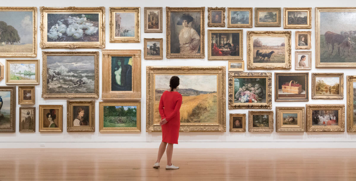
Frye Collection Page Redesign
The Frye Art Museum wanted to redesign their collection page and to make it stand out as a destination to showcase their extensive collection of artworks.
Timeline: 9 weeks
Team: Max McLoughlin, Kiwani Allen, Abby Rothman, Ratna Sari
Role: UX research, UX/UI Design, Wireframe, prototype, Strategy
Tools: Pen & paper, Google Forms, Trello, Figma
FryeMuseum.org
The Approach:
I worked with the Frye Art Museum marketing team to uncover the pain points of the current collection page design and how to incorporate the redesign into the current website’s IA.
Competitive Analysis
After an initial meeting with their marketing team, our team wanted to know more about the industry and how competitor websites presented their collection pages.
We focused on three museums creating a table of pros and cons of each museums page. This helped highlight heuristic design principles within different museum websites.
Expert Interviews
Frye wanted us to focus on how educators, colleagues, visitors and staff interacted with their site. We each took on a category, so I chose to work with educators. I was curious about how teachers interacted with exhibits online, also how they planned curriculum around visiting museums and how we could help with this online.
I sat down with two teachers to find out what information drives them to certain museums websites and what they are looking for when exploring a museum’s collection page.
I found that teachers primarily looked at the collection pages to find out what the top artworks to see when bringing a class to visit. They have very limited time in the museum with an entire class and wanted to know the “must sees” to make the visit as valuable as possible for students.
We found 5 major pain points to focus on while redesigning the Frye Collection page.
After we combined our interviews, analyzed the competitive audit and held Frye’s Collection page in comparison, these were the pain points discovered.
The page was not searchable and had no filters or sort options leading to a lack of engagement and findability. Their internal team was using command-f to find works of art.
It had low contrast and wasn’t up to date on accessibility needs. After doing accessibility testing and some interviews we found that the font was too thin and that the colors were a challenge to read.
There were inconsistencies and lack of standards on each page and the collection sections had a different feel and lacked a sense of unity.
No information on what top artworks are on display, visitors wanted to know more information to help build a plan for what to see in the museum.
Browsing was not set up to keep users on the site to find new and exciting works.
With our research we began to explore different design solutions to the challenge.
Wireframes
I sketched wireframes to get a feel for how the site needed to flow and to help communicate ideas to the Frye and to the team.

I began to explore different solutions to the pain points we discovered, while finding a standard and consistency of how each page should be displayed. I created a brand guide and filter guide to help keep us aligned and since this would help solve some of our findings.
Prototype
I built out the prototype in Figma. We chose Figma for its ease of collaboration and since we were under a short deadline this became crucial as we wanted enough time to test, rework and test again.
User Testing
With the prototype, I tested several participants with a moderated guide to find any red flags in the new design.
I found that some of the language used on our prototype was not universally understood and confused the user when trying to complete tasks on the site. “Recently on View” which is used across a number of major museums sites tripped people up so we highlighted this as an area to fix.
I learned that clients have their own languages within their work worlds and that I need to take the extra effort of learning these nuances.
The Results:
The Collection page is now searchable and has filters on both the mobile and desktop site.
The Collection page now meets a Level AA rating in accessibility.
I created a consistent and standardized brand guide for the Frye to use moving forward when setting up new pages.
We created an “On View” section that highlighted top works on display at the Frye. Including ways to engage more users by adding rotating sections such as “Frye Favorites” and “Top works from the Founding Collection.”
We created in-depth art and artist pages that allows the user to discover quality content while letting them browse through different related sections to discover new works and artists.
Final Thoughts:
I would love to explore QR Codes for artwork that is on display. Work on engaging people at the museum to the collection page.
Also, the ability to ‘Like’ or ‘Save artwork’ creating a unique inspiration board.
The Frye is moving forward with our design and are going to build it out. We will be there along the way helping them create their new collection page.