

Caffe Vita Website
Caffe Vita needed their website updated to increase online sales and to better position their brand digitally.
Timeline: 4 months
Role: UX research, UX/UI Design, Art Direction
Tools: Pen & paper, Adobe Creative Suite, Figma, Shopify
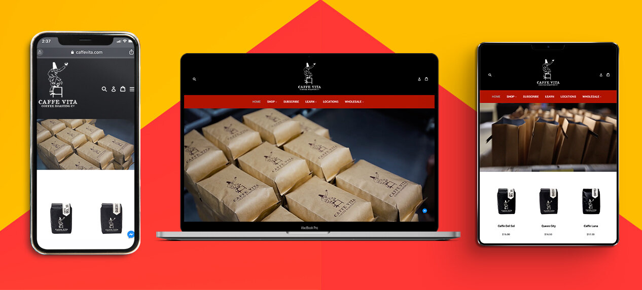
CaffeVita.com
The Approach:
I managed a team of two to redesign caffevita.com. The old site’s backend built on Drupal and Magento was old, confusing and complex. We tasked ourselves with designing a site that embodied the culture of Vita. Focusing on increasing traffic and sales, while making the backend easy and accessible for internal teams.

The old site was locked into a custom designed template through Drupal and Magento so it was hard to change anything about the site but images. The black also restricted image coloring and what could be displayed in a clear way as dark images didn’t stand out.
We knew we wanted to use Shopify as our site builder, knowing this early on was a time saver as I could design with that platform in mind.
The first step was to document the site inventory and create a site map to help me catalog and map the different sections.
Competitive Analysis
After meeting with stakeholders regarding the new direction of the site I realized that I needed to see what our competitors were doing digitally.
I filtered through our top 10 competitor websites and narrowed down a deep dive into the top 3.
Through this I learned that that each site had an extensive shop online beyond coffee. Coffee subscriptions and lifestyle merchandise were given equal importance. Each sites branding was very sleek and modern, using primarily light background colors and there were limited time deals galore.

Site Map
I indexed the site to help identify what was available on caffevita.com to better understand how the old site operated and what we can expand on or omit.
I created a site map to visualize these paths. This became very helpful in structuring the build out the wireframe.
Wireframes
I sketched out wireframes to get an idea of the hierarchy of the site and to get my brain spinning on different variations of layout.
I then built out basic wireframes in Figma as this was going to be the program I build out the prototype.
Prototype
The stakeholders were getting confused looking at wireframes so I decided to build out a hi-fidelity prototype to better illustrate the vibe and flow of the site.
This really helped to show the new areas of the site and the improvements to existing content.

The Results:
After a year of running the new Vita website. We have achieved our main goals of increasing sales online. The highlight being in December where we doubled our revenue.
We also made the backend approachable to the stakeholders, allowing them to manage their sections and to make sure they can do their job effectively and efficiently.