Website main page boxes-03.png

Fremont Brewing Website


Fremont Brewing Website

Fremont Brewing, a craft brewery founded in 2009 in Seattle, wanted a website refresh built to integrate new branding, help increase revenue and to help enhance their digital presence and user engagement.


Timeline: 12 weeks

Role: Creative direction, UX/UI Design, Wireframe, prototype, Developer, Research

Tools: Adobe XD, Adobe Creative Suite, HTML, CSS , Javascript

FremontBrewing.com


The Approach:

Before I can get to our three assigned tasks for the new Fremont Brewing website:

- Injecting the new branding

- Increasing revenue

- Enhance user engagement

I wanted to get an overall sense of how their old site was currently laid out to see what areas can be combined, omitted and highlighted.

Site Map

Before I headed too deep into the redesign, I wanted to find out what the overall architecture of the site was to help create an overall strategy. I did this by setting up a detailed site map that help inventory everything that was going on with their old website.

I discovered that the e-commerce portion of the site was hosted on two different hosts linked off their main webpage. One being their Kotis shop and the other a Square store.

Wanting to make this an easier interaction for the user and to help focus the site to make it easier to learn, purchase and explore Fremontbrewing.com. I flagged this for discussion with their team and made the recommendation to solidify this through a e-commerce platform such as Shopify, I came to learn from this meeting that this was baked in to the way they have everything set up including retail and would be something I needed to work around.

This helped me to make better decisions on how to make the site more focused while knowing what my invisible limitations were before i started.

Competitive Analysis

After meeting with the stakeholders of Fremont Brewing, we narrowed down a handful of breweries, big and small, to check out in preparation for the design. Wanting to see what is done right and wrong in the space.

After doing a deep dive into these breweries with a pint of Sky Kraken and expanding the list through my research I began to, get inspired, identify Fremont’s strengths and weaknesses, and conceptualize the redesign.

Below is where I landed on the proposed navigation layout.

Wireframing

The next step was to build out a wireframe based on the approved navigation layout above, meeting with stakeholders and consolidating the research done thus far.

I chose to build the wireframes out with Adobe XD. First step was to sketch out my thoughts. Then work on a low-fidelity version to show the stakeholders. Once the initial revision was complete I moved on to a hi-fidelity mock up as that was what the clients wanted to see most.

After a couple iterations, we landed on the above wireframes to kick off the building of the website. Showing them prototypes to walk them through how the site would be clicked through really helped them understand the new flow of the website.

Developing

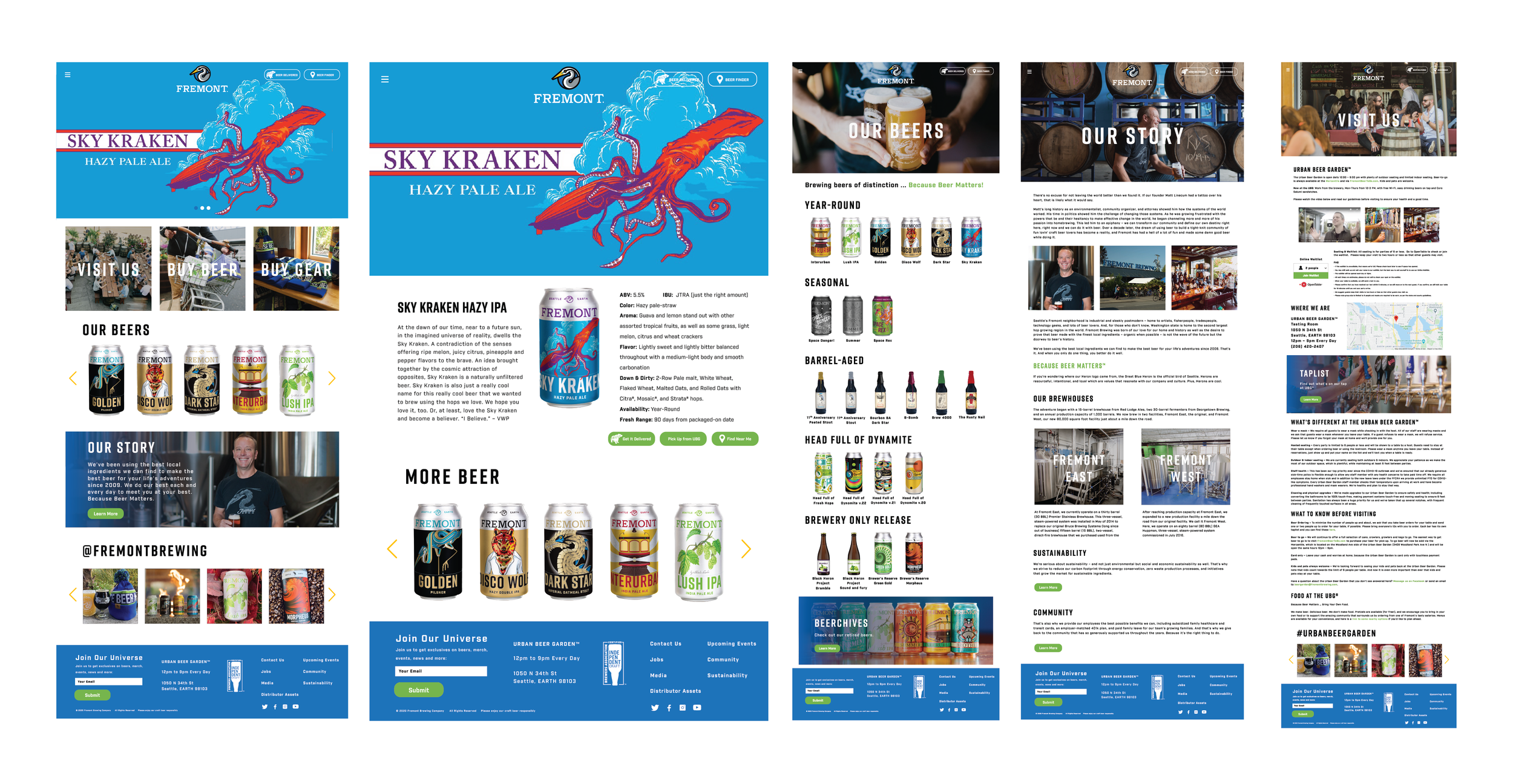
During the build I implemented HTML, CSS and Javascript into the website to get it to a completed project. During the 2 months of building this out there were 3 rounds of revision where I met with the stakeholders and let them scroll around the draft until we landed on the website that is currently live. I worked with the design team at Fremont Brewing to give them all the details, tips and lessons that they would need to know to take the project forward so that there was no gaps when I walked away from this project.

The Results:

This has been one of my favorite personal start to finish build to date. The final product turned into a beautiful site that achieved all 3 goals (Updated branding, increase in revenue, and enhanced user experience) after a year in use.

Looking back there are things that time and budget restricted.